So you want to take a stab at UX Design.
It may seem daunting to figure out what elements you need to focus on in order to design something successfully. What do you need to keep in mind? What matters most for a great user experience?
Good UX design incorporates a lot of different aspects of an experience, and we’re here to give you a rundown on the most important ones to get started.
Usability
Usability goes to the top of the list because it is crucial in designing a functioning user experience.

Essentially, usability is how easy and functional a user interface is to use. Content needs to be easily discoverable, readable, and understandable.
How to interact with the website must be quickly understandable for the user. If they have to spend a lot of time clicking around trying to figure out what to do, they’ll get frustrated and leave.
There’s so much content out there, and so many competitors to any field, that if the experience doesn’t immediately feel usable, they can find something else.
This element doesn’t necessarily mean visual appeal (we’ll get to that), but more how intuitive the experience is. How well it flows. How clearly the user can see it will solve their problems.
Desirability
The number one company everyone seems to look to for this element is Apple. They have done a fantastic job at becoming an iconic, desirable brand and it shines in their user experience.
Images are sharp and exciting.
Their branding itself is cohesive and recognizable, so you have to sell it and make it look desirable.
Design your experience to make your company feel desirable. Invoke emotions in your design—provide reasons why they want what your company has to offer.
Navigation
The navigation of your user experience needs to be intuitive.
In order to achieve this, think like the user would think.
Where do they expect certain elements to be? What buttons do they expect to have, what abilities do they want to have while on a particular page? Get into their minds and build a path that they can easily follow.
My husband recently had to learn to operate a very old accounting system, and he complained that in everything that he would look for, when he would go where he expected it to be it was never there. Nothing made logical sense. Avoid this at all costs!
People expect a user experience that fits their needs. They have come to prefer a humanized experience, one that can be navigated almost like a human interaction.
And to top it off well, provide a clear call to action to show them what to do with the information. Just remember— a navigable user experience is a happy user experience.
Adaptability or Accessibility

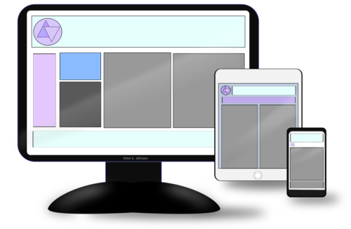
Adaptability is another important element! Essentially this means that your experience must translate across platforms.
Users must be able to access it easily whether it’s on a mobile device, a computer, etc. And it needs to function the same so that switching methods isn’t a big shift.
Did you know that over 50% of users will finish their online experience on a different device than they started with?
This is part of providing a positive UX experience. A website on a mobile device may be laid out slightly differently than the desktop version, but it must function seamlessly.
The translation across devices and seamless usability is the mark of a well-designed experience.
Value
The value you portray throughout your experience is also vital.
Within the design, clearly show how valuable your concept or product is. Provide the ability to do more with your brand or company through your experience than anywhere else.
If possible, you are even tasked with figuring out the things they don’t even know they want. If you can accomplish this, you can wow users and they will be impressed by the experience.
Essentially, figure out how your design can prove to align your product features with their needs.
Design
Did you think it was odd that we saved design for the end?
Isn’t it called UX design?
While design is undoubtedly important, the above elements need to be considered in laying out the design first, so that you can then craft a beautiful user experience that also makes sense and fills the purpose it’s intended to.
In the element of design, less is typically more. Don’t overdo it. Your task is to strike the perfect balance between personality and excitement with simplicity and not overwhelming users.
Don’t pack every single idea you have onto a page, or they’ll all crowd each other and lose edge. Nothing will stand out. This translates in color schemes too—where picking 5 colors or less for your brand palette will serve you well in looking professional and cohesive.

Come up with a few elements to use across your experience, and make sure to stick to them. If the design feels too all over the place, you’ll lose professionalism.
UX Design is an important aspect of any website! If you’re looking for help implementing it correctly on your website, look no further. Contact DevSimplify to lend you a hand today.


